Homepage Redesign.
Our redesigned homepage was recently recognized by E Source as a “Standout Feature” in their latest utility website benchmark.
The problem:
Incredibly outdated, inaccessible, cluttered, and busy homepage (and site)
The solution:
After many varied iterations and countless usability tests with both actual customers as well as from user input through Lyssna, we came up with a recognition-worthy homepage that made it so much easier for our customers to get what they need.
After going through all of our customer journey mapping and pain point discovery, we needed to make sure to give our customers the exact things they need and make it incredibly easy for them to find.
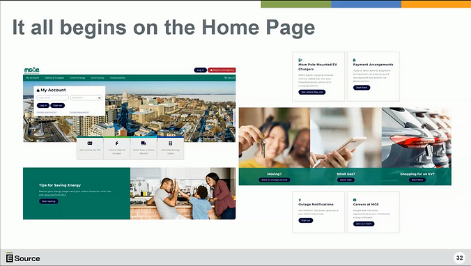
I came up with the Quick Action Bar—the main feature navigation that provides the customer with the simplest, most recognizable way to complete the action they came to the site to complete. The number one customer journey is, predictably, paying the bill. Which is why I made this the very first tile in the QAB. Outages are also incredibly important and while they don’t happen super often, we needed to make sure they could easily access the outage map without having to search for it. That’s why that is the number two tile. Following that is the customer journey of starting, stopping, or moving service. The last tile is for the Estimate Energy Costs tool so customers can estimate energy usage costs of a residence. With the rising costs of nearly everything in today’s economy, I was also in the process of adding a fifth tile to the QAB for financial assistance called, “Help with My Bill” which would have gone in the second tile spot.
